Mohit Bhatt
2025-02-10
7 min read
Shopify vs WooCommerce: Which is the Best eCommerce Platform for 2025?
If you’re planning to start an online store in 2025, you’re probably debating between Shopify and WooCommerce.
Read MoreMobile devices have changed the way we shop. Statistics report that there has been a considerable rise in eCommerce revenue over the last year. In 2022, eCommerce Revenue Growth was reported at 4.57%, whereas the number now(2023) has grown to 9%. The numbers for 2024 and 2025 are already here, standing at 18.71% and 20.36%, respectively. This data is enough to understand the enormous potential that mobile eCommerce holds. With an impressive growth rate as depicted, business owners must now focus on building mobile-friendly eCommerce solutions that can help them attract potential leads.
April 21, 2015, Google released its “mobile-friendly update,” which was focused on improving the rankings of mobile-friendly pages. In 2016, it announced that it would be strengthening the mobile-friendly ranking framework. This significantly impacted mobile search results and paved the way to the development of websites that were mobile-friendly.
It won’t be an exaggeration to say that today’s world is based on smartphones. With more and more people depending on their smartphones for just about every need, it has become ever important to have solutions that are accessible on our mobile. But is this the only reason why you as a business owner should focus on building mobile-friendly eCommerce solutions? We’ll explain in this article.
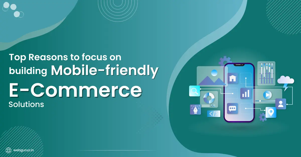
While there is a complete section of consumers still isolated by the inception of smartphones, mCommerce(short-term for Mobile eCommerce) continues to spread its roots. And there are several factors that are driving this trend:
Increasing Smartphone Usage
As per a report from Statista.com, during the fourth quarter of 2022, internet users worldwide spent 57 percent of their time browsing the internet via mobile phones. This represents an increase compared to the fourth quarter of 2021, a year in which global internet users spent around 54 percent of their online time accessing the internet via mobiles. Between the third quarter of 2013 and the fourth quarter of 2022, internet usage via mobile has experienced a constant growth trend. Adding to that, with an estimated 1.9 Billion fifth generation (5G) subscriptions worldwide, smartphone use for even the smallest tasks is on the rise.
This widespread adoption of smartphones and high-speed internet connectivity has made it easier for people to shop online anytime and anywhere they want. Several other initiatives by Governments like “Digital India Initiative” by the Govt. of India, discounts and cashback offers on online shopping have encouraged people to shift to mobile eCommerce.
Increased Consumer Spend on Mobile Apps
According to another study by Statista, between 2019 and 2021, consumer spend on mobile apps has experienced a constant increase, climbing up to 170 billion U.S. dollars during 2021.
In 2022, the total consumer spend on mobile apps was approximately 167 billion U.S. Dollars. And, in the most recent quarter(Q1 2023), the total value of global consumer spend on mobile apps amounted to 33.7 billion U.S. Dollars, up by two percent compared to the corresponding quarter in 2022.
This significant rise in the consumer spend on mobile apps is also another reason why building mobile-friendly eCommerce stores is important now more than ever. Furthermore, since mobile devices offer the convenience of shopping anytime and anywhere, these solutions will help you increase revenue manifold. This aligns well with the modern and fast-paced lifestyle of today’s world.
24/7 Support Availability
Mobile eCommerce solutions enable easy support through multiple channels. These can be live chat, chatbots, social media messaging, or call support as well. With mobile-friendly apps, the need to visit a physical location is eliminated, and you can get quick and responsive support at just a tap of a button.
Building mobile-friendly mobile eCommerce solutions is crucial to achieving bigger sales numbers and enjoying other benefits. Here are some reasons why you should focus on the same:
As mentioned, over 60% of the internet traffic comes from mobile devices. Being an integral part of our lives, it is important to build solutions that are accessible on these devices. This will allow you to tap into the massive user base that prefers to browse and shop for products and services online on their smartphones.
Mobile-friendly eCommerce solutions offer convenience like no other. Users can shop on the go, during transit, break times, or being engaged in some other activity as well. This ability to access the online store from anywhere and at any time helps enhance the overall shopping experience and encourage repeat visits to your eCommerce store.
A mobile-friendly website is designed using responsive layouts and use-friendly interfaces. This means that regardless of the device which users are using to access the site, the design adapts seamlessly to the screen size, thus enhancing the overall user experience and conserving the functionality at core. This ensures that users can navigate through the store, explore products and services and complete the transactions without any issues.
Recommended: Why Custom eCommerce Websites Design is must for your Online Store?
In the ever-competitive online marketplace, developing unique solutions to truly stand out is crucial. Offering a mobile-friendly shopping experience will help you stand out among your competitors who may not have optimized their platforms for mobile devices. And thus, users are more likely to choose your eCommerce store which is easy to use and navigate on mobile devices.
A major advantage of mobile-friendly eCommerce solutions is their potential to boost your conversion rates. When users are able to effortlessly browse products, view images, and read descriptions on their mobile device, they’re more likely to convert from browsers to buyers by completing a purchase. With mobile-friendly websites built to ease a user’s journey from the initial interaction to the final transaction, it ensures that the overall conversion rate grows manifold.
SEO is another reason why building a mobile-friendly eCommerce store is important. SEO or Search Engine Optimization, refers to the practice of optimizing your website for relevant keywords. The ranking algorithms change from time to time, thus making it difficult to predict the rankings.
Search engines prioritize mobile-friendly websites that are easily crawlable and offer the best user-experience. When you have built your eCommerce store the same way, Google automatically pushes your website to the top ranks in the SERPs. And, with more and more users searching and shopping on mobile devices, your search engine rankings and visibility are potentially improved.
A mobile-friendly website/store will complement your mobile app by providing a consistent brand experience across both platforms. Users can seamlessly switch between the app and mobile website without facing any kind of usability issues. The website would perform best with all the features working seamlessly thus improving the overall functionality.
Social media is the ultimate tool that can greatly influence a user’s purchase decision. By having a mobile-friendly eCommerce solution, you can integrate easily with social media platforms, thus allowing users to discover and purchase new products directly from their social media feeds. This increases the chances of making sales and growing your revenue manifold.
Mobile-friendly platforms can leverage user data to offer personalized product recommendations. You can provide tailored suggestions based on user preferences, browsing history and other purchase data that resonate with individual shoppers, leading to improved engagement and increased chances of conversions.
A mobile-friendly site helps reduce bounce rates and boosts user engagement. Users who visit your ecommerce site via smartphones stay for longer and are also more likely to return to your site. They may also recommend it to others and thus increase conversions. This allows you the opportunity to build and nurture client relationships and increase user satisfaction.
In a world that’s driven by the internet, if you do not have a mobile friendly eCommerce Store, you are missing out on a lot. An increasing number of your competitors may already be using mobile-friendly solutions to attract customers and grow their bottom line. Now, it’s your turn to do the same. Here are some ways you can do the same:
A website that looks good on any screen is bound to attract customers and contribute to growing your revenue. Mobile-friendly websites should adjust their layout based on what kind of screen users have. As mentioned, an increasing number of people now use mobile apps to browse the internet and shop online. Therefore, the way you design your website will determine if they can find you. If you are looking to test your website for mobile-friendliness, you can do a small test using this test tool.
Recommended Read: The Art of Crafting Beautiful and Responsive Web Design: Tips from the Experts
Dynamic content on webpages updates itself automatically based on user actions. You don’t have to refresh the page manually. You can create dynamic content using languages like Javascript, PHP, and more.
This type of content is perfect for providing updated information on the products and services you deal in. You can use a CMS to write a blog post, add images, and text. You can also explain details about your product and then publish it. This way, you don’t have to keep refreshing the page to get updated information; instead, the page updates itself automatically.
However, when you are doing so, make sure that the images, videos, and other media you use are optimized well. This will ensure that the website is able to adjust to varied screen sizes effortlessly.
One of the most common mistakes that a lot of people make is using HTTP redirects on mobile devices. Doing so can cause the user to lose their place on the page and also increase the load times. This will only increase the page bounce rate and lost user base.
Other mistakes like including unplayable content, providing a faulty redirect, setting viewports incorrectly, using unresponsive web fonts, and more, also need to be avoided. Try using Google Page Insights to identify issues that are slowing down your website speed and follow the design best practices to correct them.
Also Read: 10 Best Ways to Make Your Website Load Super Fast
Having a mobile-friendly web design is crucial for businesses to grow their bottom line. If you do not have a mobile-friendly website, you are missing out on a lot of valuable traffic and profitable conversions. Building one will open a lot of new opportunities for your online business and only push it to the next level. Consider following the tips discussed in this article to build a mobile-friendly eCommerce store and watch as your revenue takes flight.
Latest Mobile App Development and Online Marketing News, Insights,Trends delivered weekly to your Inbox.
Stay updated and join the buzz with these topics.
Mohit Bhatt
2025-02-10
7 min read
If you’re planning to start an online store in 2025, you’re probably debating between Shopify and WooCommerce.
Read MoreMohit Bhatt
2025-02-10
7 min read
If you’re using Pardot and feel like it’s holding your marketing team back, you’re not alone. Many businesses are switching to HubSpot CRM because of its user-friendly interface,
Read MoreMohit Bhatt
2025-01-31
7 min read
As we move into 2025, one of the most effective ways to achieve business success is by leveraging professional eCommerce website development services.
Read MoreDrive more leads, maximize your RoI, and grow your business with digital solutions built specifically for your business.
Sales - provider@webguruz.in
Jobs - careers@webguruz.in
4th Floor, SM Heights, C-205, Phase 8 B, Sector 74 Mohali
11 Rydons Lane, Coulsdon, CR5 1SU, UK
6917 Hovingham Court Centreville va 20121
31 Newmarket Parade, Mickleham, VIC, 3064,Australia